Splash of paint
Posted on October 7, 2024
I recently ported this blog to Astro to test it out. The main reason I did that was to see if I start to focus on making the site better and writing more often instead of code golfing with generator functions.
And today, I surprisingly did exactly that. I gave the entire site a new splash of paint.
Design
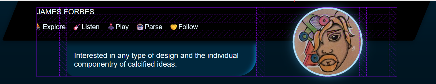
The previous design was deliberately austere. I didn’t have the time to put a lot of energy into it so I just needed something legible. But it was also super boring and flat. I also feel like in my “online persona” I have boxed myself in a little bit. I don’t like to hurt people’s feelings and so I’m pretty diplomatic online, I also hesitate to get too political or even go into just areas of interest that might bore my primarily programmer followers. But at this point in my life, I don’t care. I’d rather a little zest and colour and talk about whatever I want. It might alienate some people, but conversely it might do the opposite.
Colour forward
So for this design I wanted it to be colour forward. In the header I’ve added some Emoji, I blew up the site logo and tilted it a bit with some glow. I’ve skewed the header BG (you won’t see this on mobile). I’ve got asymmetric border radiuses. I want whoever lands on the page to get the impression they might read or discover something unexpected, but also I want to inspire myself to not be so serious and professional all the time.
I wanted the background colour to not be grey, or white, or black. But I was concerned making the background color variable would impact legibility. So I’ve used a linear gradient that gets close to black pretty quickly.
linear-gradient(hsl(var(--hue), 100%, 9%), 8%, hsl(var(--hue), 100%, 3%))
That 8% part means it starts transitioning to the 3% lightness variant after 8% of the vertical height. Which is roughly the height of the header. I think it is legible, but let me know if you’re having trouble.
I also plan to make a light mode eventually too for those the prefer that.
Named grid lines
One cool challenge was the header uses named grid lines. I’ve never used them before, I tend to make do with template areas or template columns/rows. But for the header it was exactly the right tool for the job. It’s cool to use grid to create the impression of a random arrangement of differently shaped items, but actually its a pretty ordered grid when you open it up in web inspector.
I also tried to use subgrid somewhere but it didn’t work the way I expected so that is a journey for another day.
Tags
Surprisingly I never had a post date, or tags. Now we do. I’ve also added a tag page. You can just click on tag to navigate to it.
Or you can click a link like this one: /tags/mithril.js
I have to admit, Astro has definitely made me more motivated to implement this stuff. I’ve used a lot of frameworks. React, Svelte, Solid, Mithril.js etc.
Dynamic Hue (with HSL)
When I was coming up with the design I wasn’t sure what colour scheme I wanted to use. I knew I didn’t want it to be very busy, just one accent colour and everything else flows on from there.
So I deliberately moved all my colours into CSS variables, and then tried to make all the colour variations use the same Hue and just different levels of saturation and lightness.
This worked better than I thought it would. It seems like one of those programmer ideas that a real designer would scoff at, but I think it had this great side effect of preventing the site from getting too busy.
Another neat site effect is that you can change the accent colour live - try this out!
Drag this around to change the theme:
All we’re doing is this:
<input id="cool" type="range" value="0" min="0" max="360"/>
<script>
document.getElementById('cool')!.addEventListener('input', e => {
    document.body.parentElement!.style.setProperty('--hue', (e.target as HTMLInputElement).value)
})
</script>
We can make it even cooler. Click the button and the mouse/touch coordinates will be mapped to the hue value.
I felt like this was too cool to just keep hidden away in the source code, so I’ve mapped the hue variable to the day of the month. Each day will get a slightly different colour. I’ve minimized the range from green to purple as I wasn’t as into the red’s and oranges.
Astro
Just reflecting on Astro. It is still very early days, but I think maybe its greatest strength is that it can’t do much.
Astro is just under powered enough where I just implement things in the obvious way but just powerful enough where I can be bothered to even try.
If I implement everything from scratch I can do it, but I start to question why I’m focusing on this instead of that. But in Astro I can just import a markdown file, or inline a script tag and write typescript and not have to configure much at all.
I’m feeling motivate about adding more things, but also giving other sites I maintain a splash of paint. It’s a nice feeling.
I’m currently interested in things like:
- Making this site support ActivityPub and AtProto
- Embedding a Spotify stream (muted by default)
- Creating some astro components for live editable variables (ala light table) for my programming blogs
- Inline code editor for examples in blogs
- A little wysiwyg for this blog so I can drag and drop images into a post and have it live on S3
- Embedding DuckDB (via WASM) into a little data web powered explorer for teaching SQL
- Some kind of comment system…
- A contact form
I may not do any of those things, but I definitely wouldn’t have before. The probability has increased.
Thank you for reading. If you’d like to reach out you can get in touch on Mastodon, BlueSky.